
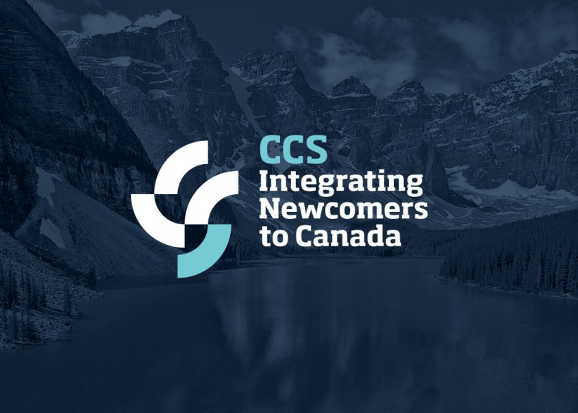
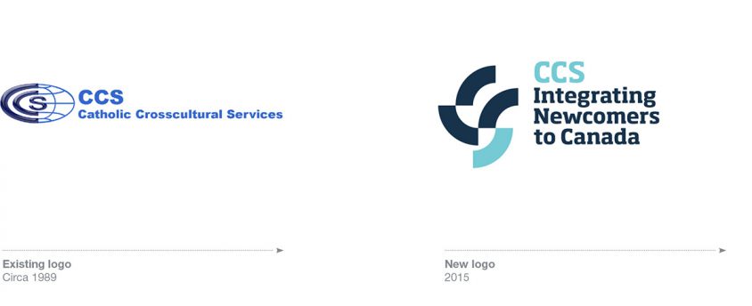
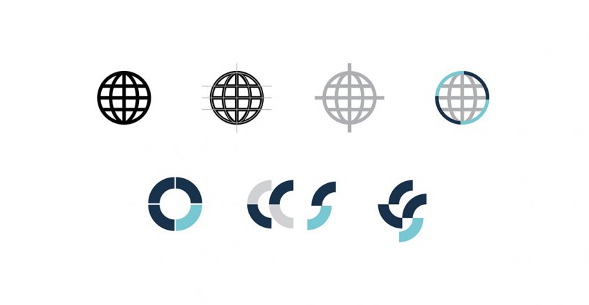
Catholic Crosscultural Services provides high quality settlement supports for newcomers to Canada. They approach RMD for a new branding system and annual report design. Their name was proving a challenge in acquiring new customers, as it wrongly implied a religious preference. Also, their icon–a globe–didn’t stand out amongst their competition. RMD recommended reducing their name to an acronym, and abstracting the globe icon into a clean monogram. Combined with a calm and welcoming colour palette and fresh imagery, the new brand communicated the bright, optimistic start that CCS brings to new Canadians.
BEFORE AFTER
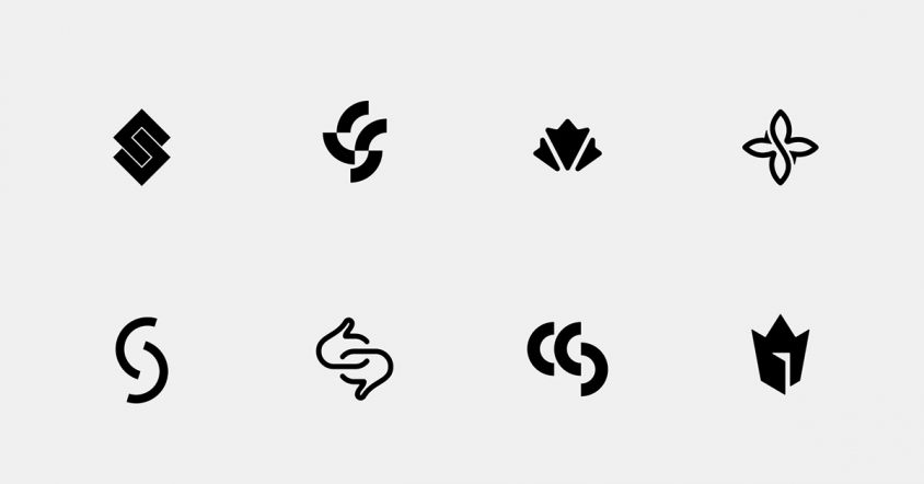
ICON STUDIES
COLOUR PALETTE AND STUDY (NEW BEGINNINGS)

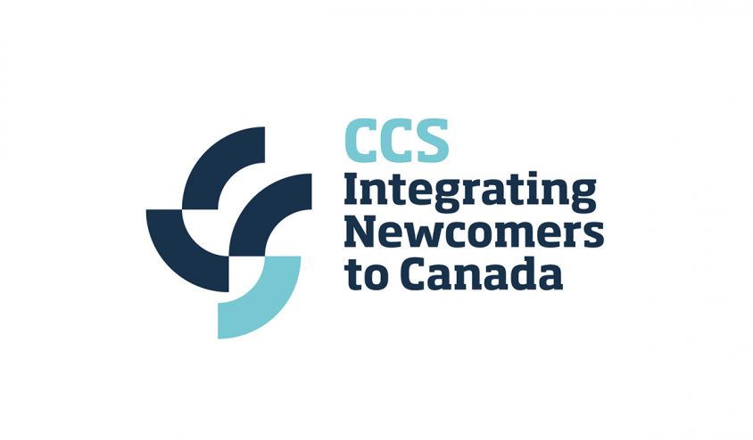
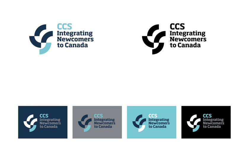
FINAL LOGO
ICON CONSTRUCTION
LOGO VERSIONS
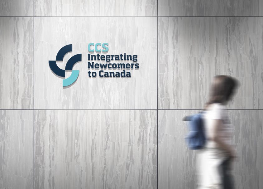
SIGNAGE
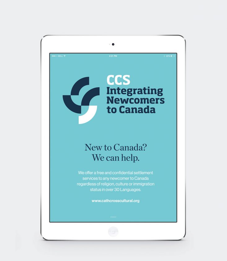
IPAD WELCOME
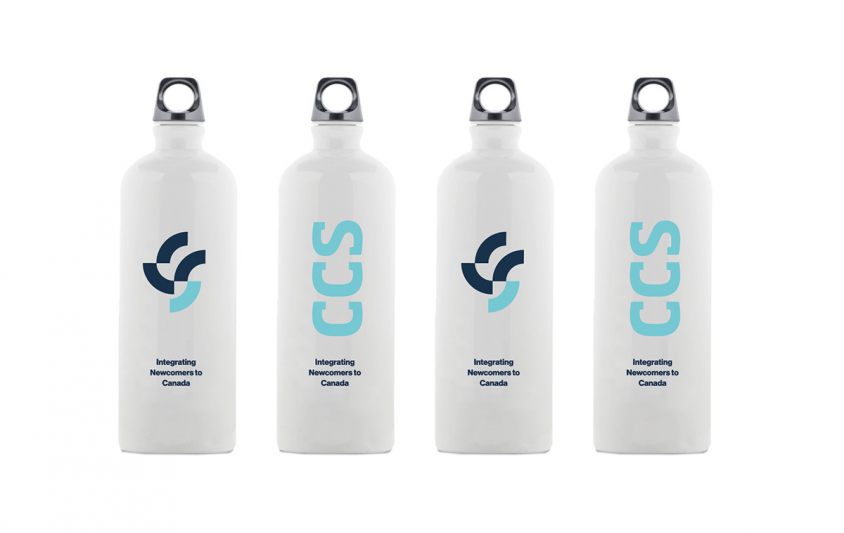
BRANDED GEAR
T-SHIRT

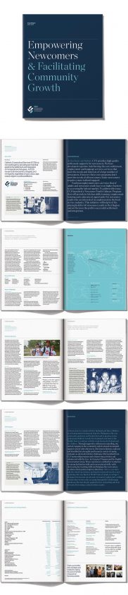
ANNUAL REPORT
Credits: Ognjen Topic and Richard Marazzi: Icon studies.