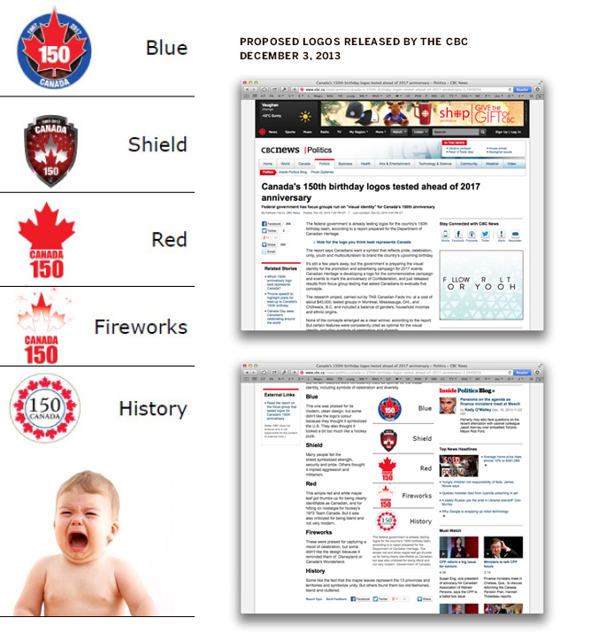
The CBC recently reported on a Department of Canadian Heritage report showcasing five logos currently in development for the 150th anniversary of confederation taking place in 2017. The response from Canada’s design community was unanimous: the proposed logos were appalling. Graphic designer, Ibraheem Youssef, developed the150logo as a way to showcase Canadian talent and let some of these designers show how they could tackle the 150 anniversary logo. The following are my full studies submitted to the 150 Logo project.
ORIGINAL CBC POSTING
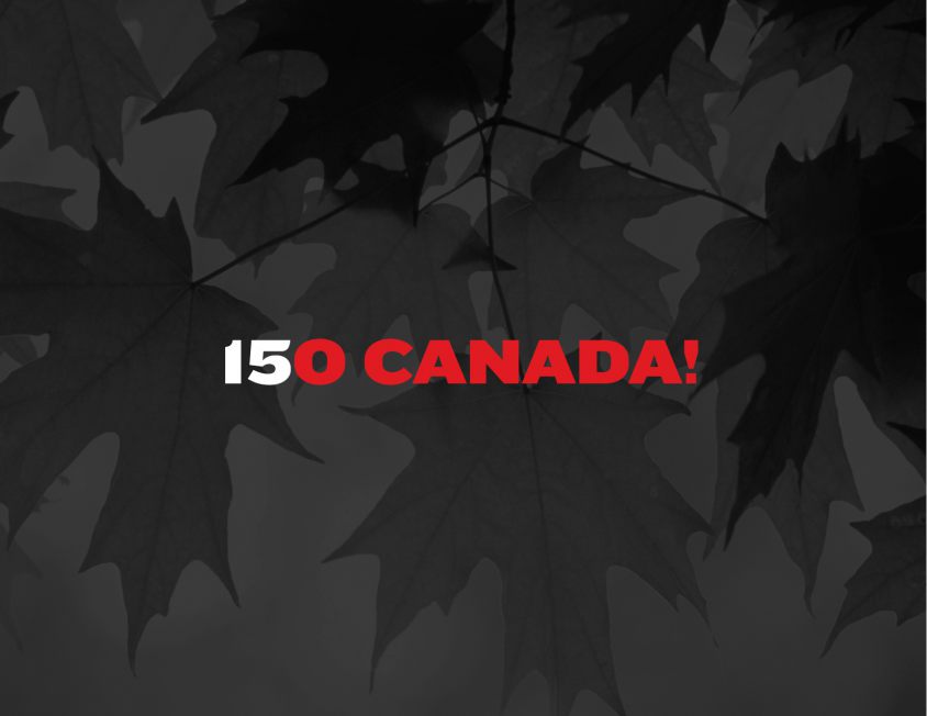
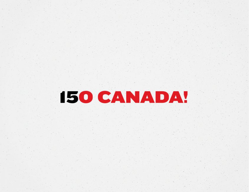
Simple ideas work best when kept simple. Some of the best logos (e.g. Fed Ex with its hidden arrow) use one witty and simple gesture to convey their message. In this case, I have re-appropriated lyrics from our national anthem: O Canada! Our home and native land!
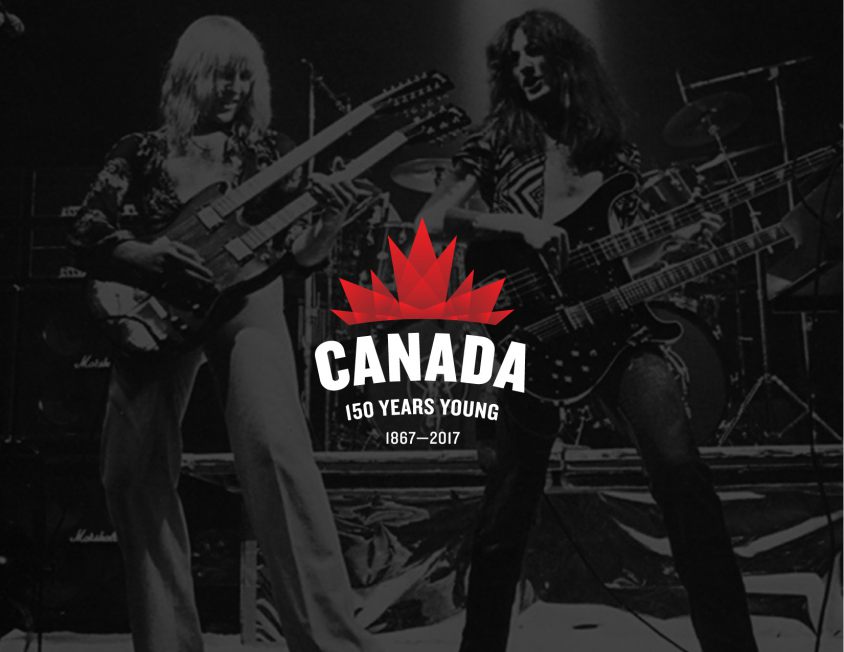
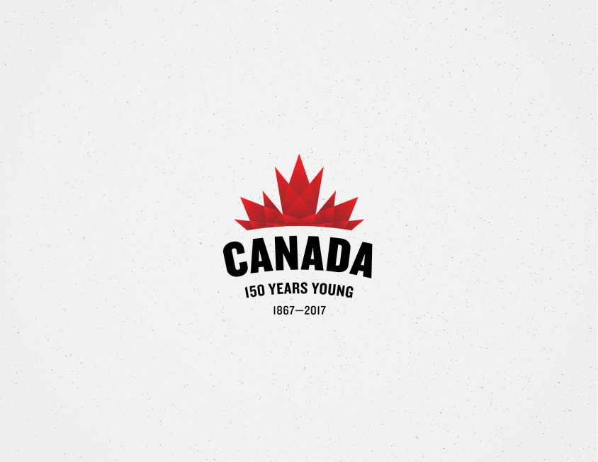
This is the most ornate of my logo studies for this project. The curvature of the word “Canada” implies that the country is located in the northernmost top of the globe. The leaf takes the form of lights or the Aurora Borealis to show off the celebratory nature of the event. The phrase “150 years young” is a playful way of emphasizing our country’s relative youth with humour and wit.
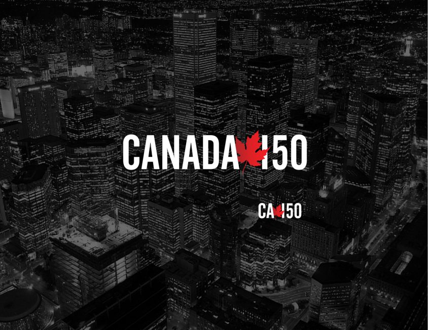
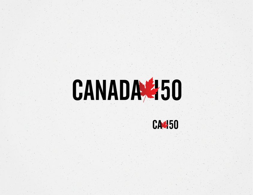
This logo has a leaf emerging from between the words “Canada” and “150.” Canada is often portrayed as a quasi “younger sibling” to our larger neighbor to the south. This treatment demonstrates how we as Canadians often surprise others by eschewing our stereotypes. The upper-case san serif type shows us as a strong nation contrasting against the organic leaf that speaks to our soft side and immense natural resources.
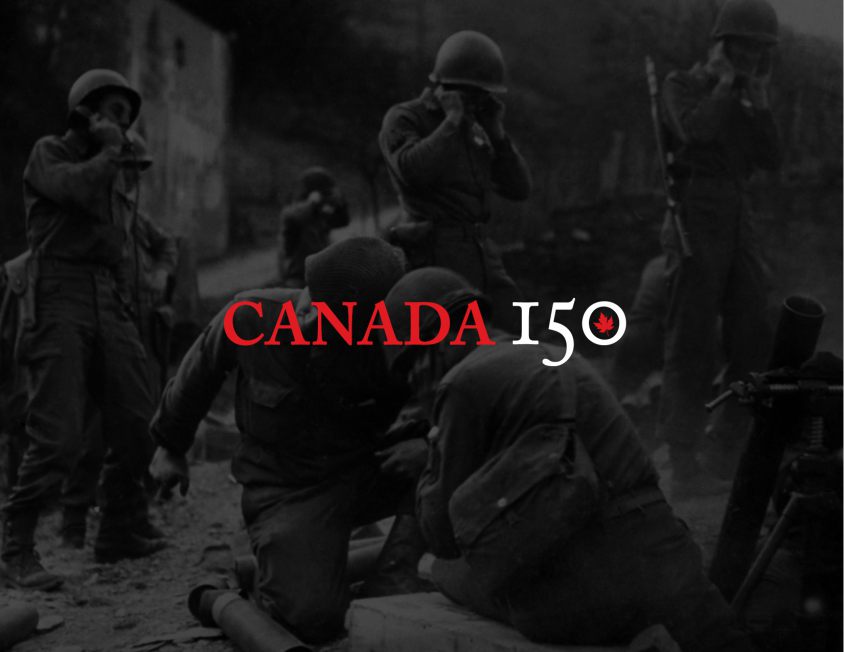
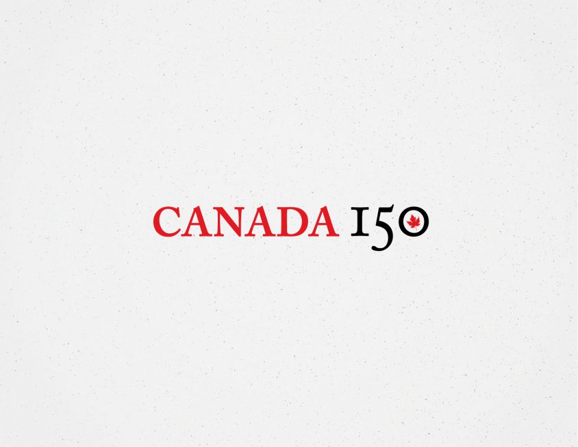
Here is a classic and timeless type treatment in an all caps serif typeface. This logo has a vintage feeling and emphasizes our nation’s history all in a classic way. The leaf in the circle pays homage to our contributions in major conflicts (especially World War II) and as a leader on the international stage
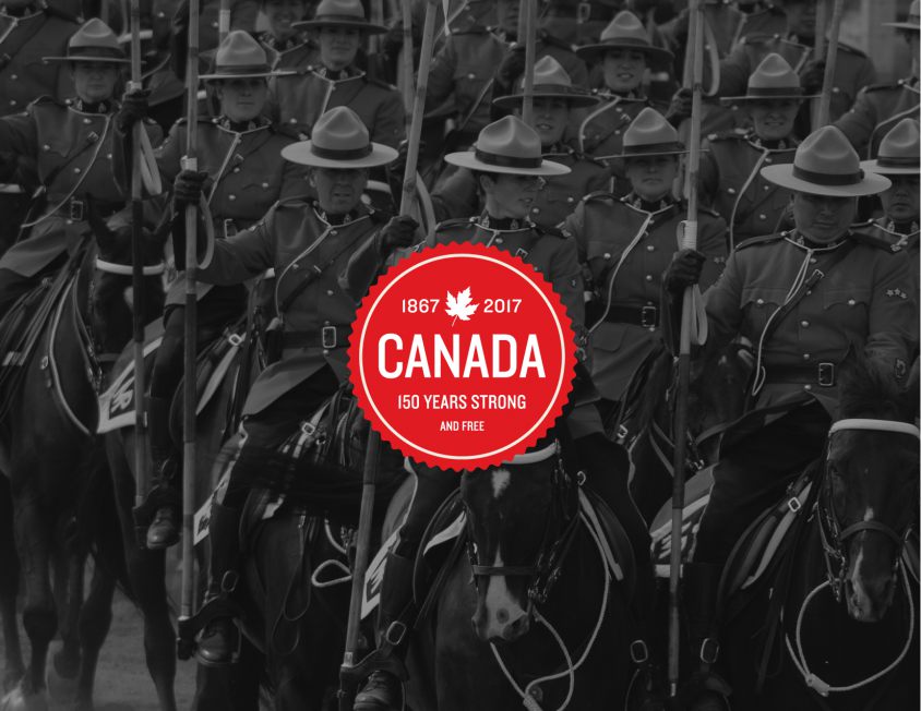
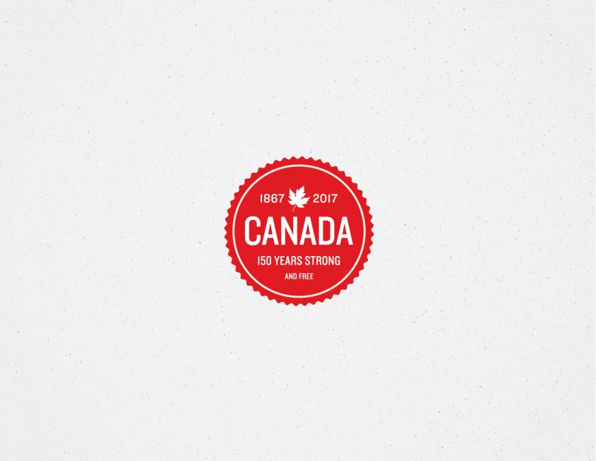
This seal combines a “retro” and vintage feel with a modern application. The tag-line “150 years strong… and free” quotes from our national anthem: with glowing hearts we see thee rise, the true north strong and free!
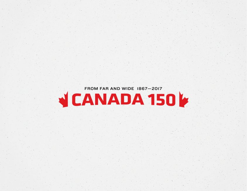
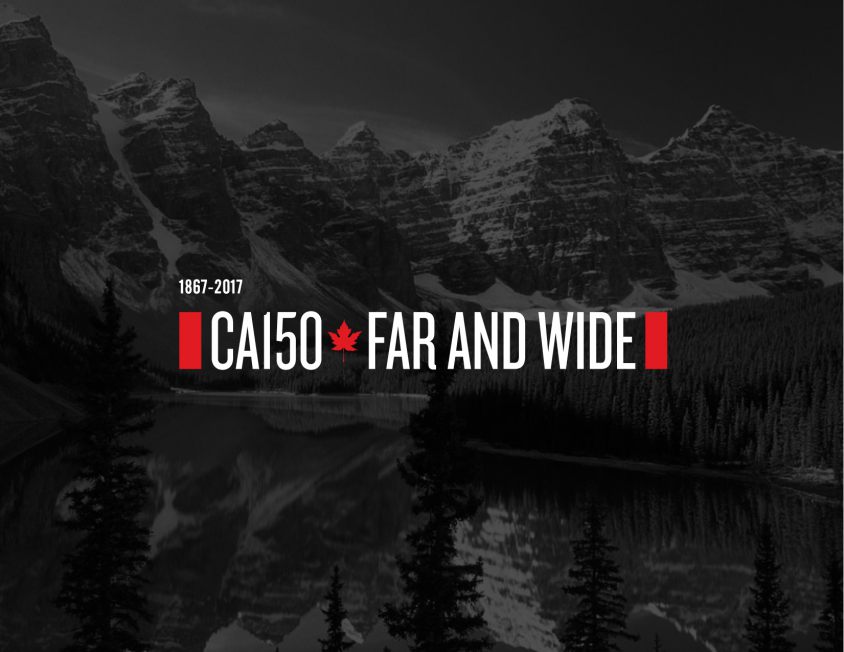
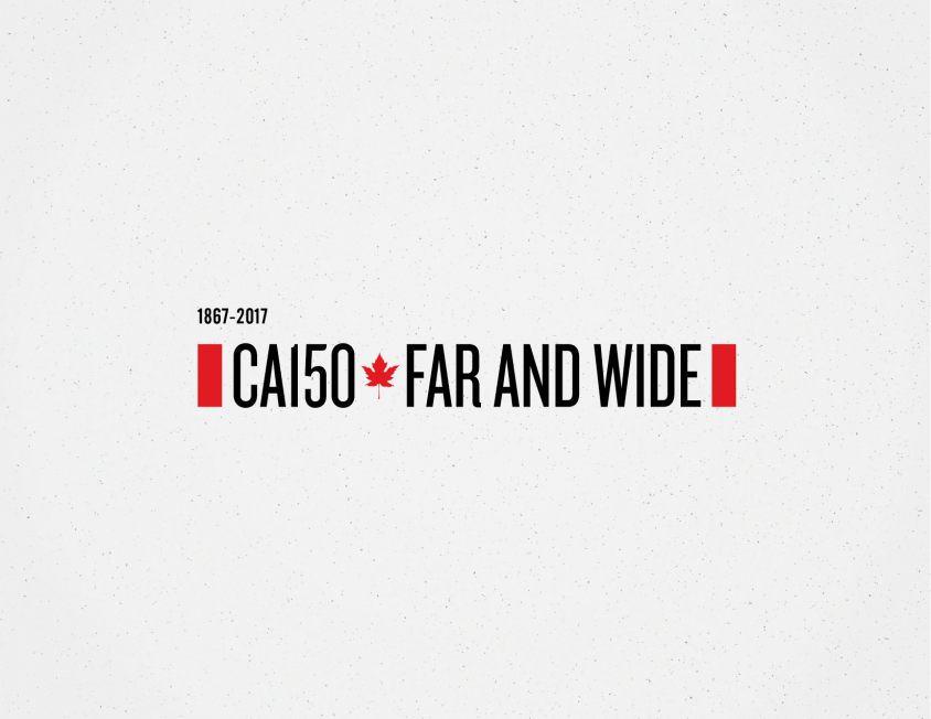
This logo re-appropriates lyrics from our national anthem: from far and wide, O Canada, we stand on guard for thee. The flag ends are spread out to show the vast geographic size of the country, as well as our diversity. This option would likely never stand up scrutiny from to a governmental committee or the wider public - but as a designer it makes me smile!
Again in this treatment, I have re-appropriated lyrics from our national anthem: From far and wide. I have split the leaf in half to represent our national motto “Ad mare usque ad mare” (“from sea to sea”) and gave the bottom of the type an arch to show our placement in the northernmost part of the globe. The type is a little more “sporty” to reflect our strong sporting traditions and Canadians’ love for hockey.